CryptoMox Blog
A Trader's Guide to Wyckoff Distribution Patterns
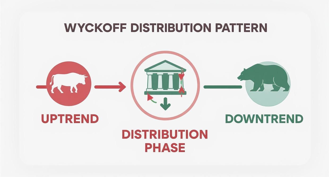
Wyckoff distribution isn't just a random squiggle on a chart; it's the footprint left behind by institutional sellers. It paints a picture of the "smart money" carefully offloading their holdings onto an eager public, right before the price is set to take a nosedive. Think of it as the final, often deceptive, chapter of a bull market.
The Story Behind Wyckoff Distribution
Imagine a department store with a warehouse full of last season's fashion. They need to clear it out to make room for a new, less-hyped collection. They can't just slash prices to zero overnight—that would signal desperation and kill their profits.
Instead, they orchestrate a "sale." They'll discount items just enough to create a buzz, drawing in shoppers who think they're snagging a bargain. This carefully managed process of selling off a huge inventory without crashing the value is the essence of Wyckoff distribution.
In the market, big players do the same. After a strong run-up, they need to cash out their massive positions without spooking everyone and causing a panic. They achieve this within a specific price zone, or trading range, methodically selling into the waves of buying from retail traders still high on bullish sentiment. The goal is simple: transfer the asset from their hands to the public's, right at the peak of excitement.
Why This Pattern Matters to Traders
Getting a handle on distribution is a game-changer. It gives you the ability to:
- Spot Market Tops: Catching the early signs of distribution can save you from becoming the one left holding the bag at the absolute peak.
- Dodge Bull Traps: The pattern is famous for its fake-outs, designed to lure in one last wave of buyers before the floor gives out.
- Prepare for the Tumble: When you see institutions systematically selling, you can get ready for the inevitable markdown that follows.
Richard Wyckoff taught traders to think of the market as being controlled by a single, powerful entity he called the "Composite Man." When you analyze a distribution pattern, you're essentially reading the Composite Man's playbook as he quietly sells off his position before the bad news hits.
Learning to spot these patterns is like learning to read the market's body language. It transforms a chaotic chart into a clear story about supply, demand, and who's really in control. This guide will walk you through that story, phase by phase, so you can see these signals for yourself.
The Anatomy of a Distribution Pattern
Think of Wyckoff distribution as reading the market's secret language—a story told through price and volume. It’s not a single, sudden event. Instead, it’s a deliberate process that unfolds across five distinct phases, labeled A through E. Each phase gives us a glimpse into how institutional players, the so-called "smart money," methodically offload their positions before a new downtrend takes hold.
Their goal? To sell a massive amount of an asset without triggering a price crash. It’s a carefully orchestrated campaign. This infographic maps out the entire journey, from the peak of an uptrend, through the sideways distribution range, and into the final markdown.
As you can see, the market doesn't just turn on a dime. It transitions from bullish control to a period of institutional selling within a defined range, which ultimately gives way to the bears. Let's walk through each phase of this critical handover.
H3: Phase A: Halting the Uptrend
Phase A is the first real red flag. It’s where the powerful uptrend finally starts to run out of steam. The bullish momentum that seemed unstoppable begins to falter as serious selling pressure from big institutions enters the picture.
It often kicks off with a Preliminary Supply (PSY), where you'll see a surge of selling on a sharp rally. This is followed by the Buying Climax (BC)—a moment of pure public euphoria. Prices spike on huge volume as retail traders pile in, but this is exactly what the big players were waiting for. They use this excitement as the perfect cover to unload a huge chunk of their holdings.
After the frenzy of the BC, the buying pressure evaporates, leading to an Automatic Reaction (AR). The price drops sharply, setting the low for what will become the new trading range.
- Example: After a month-long rally, Bitcoin surges from $60,000 to $65,000 in two days on record-breaking volume, only to crash back to $61,000 the next day. This sequence marks the BC and AR, establishing the upper and lower boundaries of the future trading range.
- Actionable Insight: Don't FOMO into a buying climax. A sharp spike on massive volume after a long uptrend is a warning, not an invitation. Mark the high of the BC and the low of the AR on your chart; these are your key levels to watch.
H3: Phase B: Building the Cause
With the initial volatility of Phase A over, the market settles into Phase B. This is where the "cause" for the coming downtrend is built. Be warned: this is often the longest and most frustrating part of the pattern, designed to shake out and confuse as many traders as possible.
Price action gets choppy and seems to go nowhere, bouncing sideways within the range set by the BC and AR. All the while, institutions are methodically selling. They’ll sell into any rally that pushes toward the top of the range and might even buy a little near the bottom to keep up the appearance of strength.
The key signal here is that rallies within Phase B, known as Secondary Tests (ST), tend to happen on lower and lower volume. It's a dead giveaway that real, committed demand is drying up.
- Example: Over three weeks, Ethereum repeatedly tries to rally back to its BC high of $4,000 but fails each time around $3,900. Crucially, each attempt is on progressively weaker volume, showing that buyers are losing their conviction.
- Actionable Insight: Patience is key. Avoid trading the chop inside Phase B. Instead, use this phase to gather evidence. Watch the volume on each rally. If it’s declining, your bearish thesis is getting stronger.
H3: Phase C: The Final Test
Phase C is the dramatic turning point, often featuring the ultimate bull trap. This phase is designed to trick the last of the uninformed traders into thinking the uptrend is resuming, right before the floor gives out.
The classic move here is the Upthrust After Distribution (UTAD). The price pokes its head above the resistance of the trading range, sucking in all the breakout traders. But the move can’t hold. It quickly fails and slumps back into the range, trapping everyone who just bought the "breakout." This failure is a massive confirmation that sellers are now completely in charge.
- Example: A popular altcoin breaks above its long-held resistance at $50, shooting to $52. Social media explodes with "breakout" calls. However, the move happens on weak volume and by the end of the day, the price is back at $49, creating a large bearish candle. This is a classic UTAD.
- Actionable Insight: This is a prime spot for a short entry. Don't short the initial breakout. Wait for the failure. Your trigger is the price closing decisively back inside the trading range. Place your stop-loss just above the high of the UTAD.
H3: Phase D: Confirmation of Weakness
If Phase C was the final warning shot, Phase D is the proof that the bears have seized control. The price action here practically screams that supply is overwhelming demand.
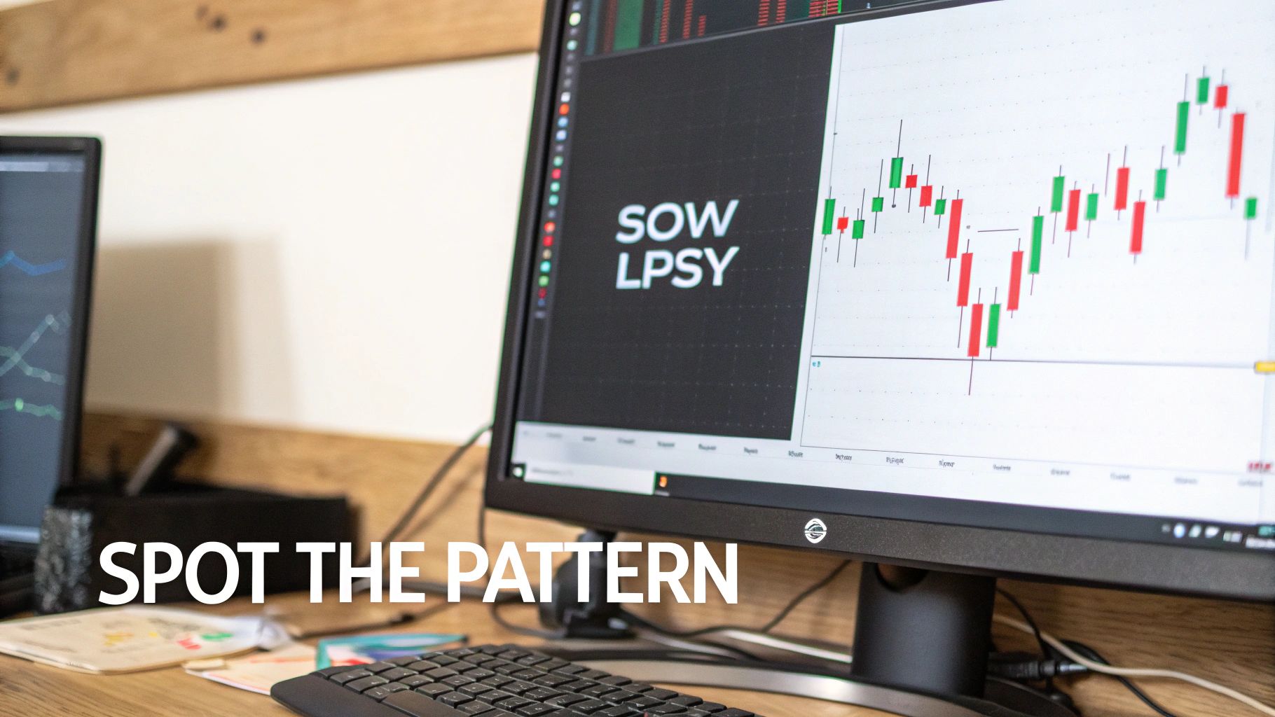
Following the UTAD, the price will drift down into the lower half of the trading range. You'll then see a Sign of Weakness (SOW)—a significant drop towards the support line, often on a spike in volume. Any attempts to rally from here are weak and pathetic. These feeble bounces form what we call a Last Point of Supply (LPSY).
Each LPSY creates a lower peak, showing that buyers are exhausted and can't even push the price back up to the old resistance. If you want to learn more about spotting this kind of indecision, check out our guide on what a Doji candlestick is and what it signals.
- Example: After the UTAD, the price falls to the bottom of the range. It then attempts a small rally, but stalls out halfway up before falling again. This failed rally is the LPSY.
- Actionable Insight: An LPSY offers another potential short entry. It represents a lower-risk entry than the UTAD because the weakness is more confirmed. Your stop-loss can be placed just above the high of that LPSY.
H3: Phase E: The Mark-Down Begins
Finally, we arrive at Phase E. The sideways battle is over, and the market is ready to move. The price breaks decisively below the support of the trading range, and the downtrend begins in earnest.
At this point, demand is completely spent, and supply has a clear path downward. Any small rallies are sold into aggressively, while declines are sharp and often accelerate as trapped buyers finally panic and sell. This is the "effect" that was built up during Phase B, and the downtrend is now fully underway.
- Example: The support level that held for a month finally breaks. The price slices through on a huge spike in sell volume as stop-loss orders are triggered, leading to a cascade of selling.
- Actionable Insight: This is the confirmation. If you're not already in a short position, the breakdown of support is the final signal. However, be aware that the risk-reward may be less favorable here compared to entries in Phase C or D.
To tie it all together, here is a breakdown of the key events and market psychology that define each stage of the Wyckoff distribution process.
Anatomy of Wyckoff Distribution Phases
| Phase | Key Events | Market Psychology & Volume Signature |
|---|---|---|
| A | Preliminary Supply (PSY), Buying Climax (BC), Automatic Reaction (AR) | Euphoria gives way to uncertainty. High volume on the BC signals heavy institutional selling into retail buying. |
| B | Secondary Tests (ST) | Deception and absorption. Choppy, sideways action. Volume diminishes on rallies, indicating a lack of genuine demand. |
| C | Upthrust After Distribution (UTAD) | The final bull trap. Price briefly breaks resistance on low volume then fails, confirming supply dominance. |
| D | Sign of Weakness (SOW), Last Point of Supply (LPSY) | Bearish confirmation. Price struggles in the lower range. Volume increases on down moves, rallies are weak. |
| E | Mark-Down | The downtrend begins. A clear break of support, often on high volume, followed by a sustained move lower. |
Understanding this framework allows you to see the market not as a series of random wiggles, but as a logical process driven by the actions of major players. You can find more foundational resources on this method over at StockCharts.com.
How to Spot Distribution Patterns in Real Markets
Moving from textbook schematics to live charts is where a Wyckoffian trader truly earns their stripes. The theory gives you the map, but recognizing the landmarks of a Wyckoff distribution pattern amidst the chaos of real-time price action is the real journey. Markets are messy, and these patterns rarely play out as cleanly as they do in the diagrams.
The goal isn't to find a perfect visual match. It's about training your eye to see the underlying story—the story of institutional selling. You're looking for a specific sequence of events and the market psychology they reveal.
Let's use the chart below to dissect a real-world example, pinpointing the key events that signaled a major trend reversal.
This chart shows a classic distribution structure. See how the phases flow into one another? It tells a clear story of buyers losing steam and sellers taking over. Let's break down exactly what you should be looking for.
Identifying Phase A: The Beginning of the End
Phase A is where a powerful uptrend first starts to sputter. It’s the market’s initial warning that the dominant trend is losing its character.
- Buying Climax (BC): This is a dead giveaway. You'll see a sharp, almost euphoric price spike on a massive surge in volume. This is often the highest point the asset will see for a long time. It's the "smart money" using all that public excitement as an opportunity to start offloading their holdings.
- Automatic Reaction (AR): Right after the BC, the price drops hard. Why? Because the intense institutional selling temporarily swamps any remaining buyers. The low point of this AR is crucial—it helps define the bottom of the trading range that will form.
Think of Phase A as the opening scene in a play. The main conflict is introduced: the unstoppable bulls have finally met a wall of motivated sellers.
Analyzing Phase B: Building the Case for a Downturn
Phase B is where the institutions do the bulk of their dirty work. They meticulously sell off their positions, but they do it in a way that doesn't cause a panic and crash the price. This is usually the longest and most frustrating phase, designed to chop up and wear out traders.
The absolute key signal here is diminishing volume on rallies. Pay close attention when the price tries to push back toward the highs set in Phase A. If each rally attempt happens on weaker and weaker volume, it’s a massive red flag. It tells you the genuine buying power is drying up. Institutions are simply selling into these little pops in demand, absorbing the buying pressure.
The essence of Phase B is absorption. Smart money is quietly absorbing the last of the public's buying interest inside a well-defined range. Weak rallies on low volume are the classic sign that the uptrend is running on fumes.
It's easy to mistake this for a healthy consolidation or re-accumulation. The tell-tale sign of distribution is the persistent failure to rally with any real conviction. If you want to get better at telling the difference, brushing up on how to read crypto charts is a great place to start: https://cryptomox.ai/blog/how-to-read-crypto-charts.
Spotting Phase C: The Definitive Bull Trap
Phase C delivers the final, crushing blow to anyone still holding onto bullish hopes. It's a textbook bull trap, engineered to sucker in breakout traders one last time before the floor gives way.
The signature move of this phase is the Upthrust After Distribution (UTAD). The price will briefly poke its head above the resistance of the trading range. It looks, for all the world, like a bullish breakout. But it's a fakeout. The move quickly fails, and the price tumbles back into the range, proving the "breakout" had no real power behind it. Often, the volume on a UTAD is suspiciously low, another clue it lacks institutional backing.
Confirming the Trend Change in Phases D and E
Once the UTAD has trapped the last of the bulls, the market is ready to roll over for real. In Phases D and E, the weakness becomes obvious to everyone.
- Sign of Weakness (SOW): In Phase D, you'll see a decisive plunge toward the support of the trading range, often on a spike in volume. This confirms that sellers are now firmly in the driver's seat.
- Last Point of Supply (LPSY): After the SOW, any attempt to rally will be pathetic. These tiny bounces are LPSYs, and they create a series of lower highs inside the range. It’s a clear sign that buyers are totally spent.
- The Breakdown: Finally, Phase E arrives. The price slices through the support of the trading range. The downtrend is now official. This breakdown usually happens on a huge surge of volume as the last of the trapped bulls are forced to sell their positions at a loss.
By walking through these phases on a real chart, you start to see how the abstract concepts of Wyckoff distribution become a practical tool for reading the market.
Developing a Trading Strategy for Wyckoff Distribution
Spotting a Wyckoff distribution pattern is one thing; turning that insight into a winning trade is another game entirely. Knowing the theory gives you the map, but you still need to navigate the journey. A solid strategy isn't just about finding the perfect entry—it's about defining your risk, knowing when to cash out, and managing the trade from start to finish.
So, let's get practical. We need to build a real-world plan for pinpointing high-probability entries, setting smart stop-losses to protect our capital, and establishing clear targets to lock in profits.
Pinpointing Your Entry Triggers
Timing is everything. Jump in too early, and you might get chewed up by the choppy, sideways action of Phase B. Wait too long, and you could miss the meat of the move. The sweet spots for entry usually show up in Phases C and D, right when the institutional selling becomes undeniable.
Setup 1: The Phase C UTAD Entry
The Upthrust After Distribution (UTAD) is the classic bull trap. It's designed to sucker in breakout buyers just before the floor gives way, making it a fantastic place to open a short.
- Entry Trigger: Don't short the second the price pokes above the old resistance. That's a rookie mistake. Instead, wait for the trap to spring. Enter your short after the price fails and drops decisively back into the trading range. A big, ugly bearish candle closing back inside the range is the signal you’re looking for.
- Stop-Loss Placement: Place your stop-loss just a tick above the absolute high of the UTAD. Think of this as your line in the sand. If the price breaks above it, your analysis was wrong, and you get out with a small, manageable loss.
Setup 2: The Phase D Breakdown Entry
If you prefer a more conservative approach, you can wait for the market to show its hand in Phase D. This entry triggers once the price finally cracks below the key support level that held up throughout the range.
- Entry Trigger: Go short as the price breaks below the support line established by the Automatic Reaction (AR). For extra confirmation, you want to see a spike in volume on this breakdown—it tells you that sellers are serious and in control.
- Stop-Loss Placement: Your stop-loss goes just above the most recent Last Point of Supply (LPSY) or right above the breakdown point. This protects you in case the breakdown was a fakeout, containing your risk immediately.
Setting Profit Targets and Managing Risk
Once you're in the trade, the job is only half done. You need an exit plan. Wyckoff’s own logic helps us project where the price might go, but disciplined risk management is what will keep you in the game long-term.
The golden rule of risk management is simple: never bet more on a single trade than you're comfortable losing. A professional standard is to risk no more than 1-2% of your entire trading account on any one idea.
This single rule ensures that a losing trade is just a small setback, not a disaster. You can dust yourself off and move on to the next opportunity. Here’s how to put it all together:
- Determine Your Position Size: Before you click "sell," calculate your position size based on your entry point and your stop-loss. This is non-negotiable for survival. If your stop-loss is 100 points away and you're risking $100, your size must reflect that.
- Set Initial Profit Targets: The "Cause" built during the trading range gives you a clue about the potential "Effect." A straightforward way to estimate a target is to measure the height of the distribution range and project that distance downward from the breakdown level. For example, if the range was $5,000 wide, a reasonable first target would be $5,000 below the support line.
- Manage the Trade Actively: Don't just set it and forget it. A smart tactic is to take some profit off the table when your first target is hit. At the same time, you can move your stop-loss to your entry price (breakeven). This instantly makes the rest of your position a risk-free trade, allowing you to ride the trend for even bigger gains if it continues to drop.
Common Mistakes and How to Avoid Them
Knowing the theory behind Wyckoff distribution patterns is one thing, but trading them in the wild is another beast entirely. The market loves to set traps, and it's shockingly easy for even experienced traders to get caught by common psychological and analytical mistakes. The first step to building a more robust trading strategy is simply knowing what these pitfalls look like.
One of the biggest culprits is good old confirmation bias. It's that tendency to see a pattern just because you're hoping it's there. After a huge run-up in price, it's tempting to view any sideways chop as distribution, especially if you're itching to short the top. This can trick you into getting in too early, right before the price takes off for another leg up, leaving you in the dust.
Another classic mistake is confusing a re-accumulation range with a distribution pattern. They can look almost identical at first glance—both are trading ranges that form after a strong uptrend. The devil is in the details. You have to look closely at the volume and price action. Distribution usually shows weak, anemic rallies on low volume, while re-accumulation shows underlying strength, with buyers absorbing dips.
Forcing a Pattern That Isn't There
The danger of wanting to see something so badly that you start to imagine it is very real. You might find yourself drawing lines and connecting dots that barely fit a Wyckoff schematic, all while ignoring the price action that screams "this isn't what you think it is." That's a surefire way to lose money.
The only way to combat this is with ruthless objectivity. Instead of actively searching for a pattern, let the pattern find you.
- Make a Checklist: Create a non-negotiable list of criteria for each Wyckoff phase. Do you have a clear Buying Climax or an Upthrust After Distribution (UTAD)? Does the volume signature match the textbook examples? If key ingredients are missing, the setup is questionable.
- Zoom Out: Always consider the bigger picture. Does your suspected distribution pattern make sense in the context of the overall market? A distribution top is far more likely to play out if major assets like Bitcoin and Ethereum are also showing signs of weakness or are starting to roll over.
The market doesn't owe you a perfect, clean schematic. Your job isn't to cram a chart into a template. It's to listen to the story that price and volume are telling you about supply and demand. If that story is confusing or unclear, the best trade is no trade.
The Power of Backtesting Your Strategy
The absolute best way to sharpen your eye for these patterns—and build rock-solid confidence without risking a dime—is backtesting. This is more than just glancing at old charts; it's a disciplined process of running trade simulations on historical data.
Here's a simple way to get started:
- Pick Your Playground: Choose a specific crypto asset and timeframe you actually want to trade, like the BTC/USDT 4-hour chart.
- Travel Back in Time: On your chart, scroll back at least six months to a year. Make sure you can't see the most recent price action, so you aren't cheating with hindsight.
- Hunt for Setups: Carefully scan the historical chart for what you believe are Wyckoff distribution patterns. When you spot one, log it in a spreadsheet. Write down the date, what your entry trigger would be (like a failed UTAD), where your stop-loss would go, and what your profit target is.
- Reveal the Outcome: After you've logged the hypothetical trade, scroll forward to see what happened. Did it work? Record the result—win, loss, or break-even. No fudging the numbers.
- Analyze the Data: Once you have logged at least 20-30 of these simulated trades, it's time to review the data. What's your win rate? How big were your average wins compared to your average losses? This process will give you an honest look at your trading edge (or lack thereof) and show you exactly where your approach needs work, long before you put real money on the line.
Combining Wyckoff Analysis with Modern Tools
Wyckoff’s principles are timeless. They give you a powerful way to read market psychology by just looking at price action and volume. But let's be honest, we have tools today that Wyckoff himself could have only dreamed of. Pairing his century-old insights with modern analytical platforms can give you a serious edge.
Instead of just looking backward at what the price has done, you can bring in forward-looking data to get a much clearer picture. This is where a tool like CryptoMox becomes incredibly useful. Wyckoff is brilliant at telling you that a big move might be brewing, but it's not a crystal ball for when it will happen. By adding AI-driven projections into the mix, you can stress-test your thesis and see if a data-driven forecast agrees with your analysis of a Wyckoff distribution pattern.
Validating Setups with Forward-Looking Projections
Let's say you're looking at a 4-hour chart and you see what looks like a classic distribution pattern taking shape. You've marked up your chart: you see the Buying Climax, the sloppy sideways grind of Phase B, and what you think is a failed Upthrust After Distribution (UTAD) in Phase C. Everything in your gut says "short," but you're still looking for that one last piece of confirmation.
This is the perfect time to pull up CryptoMox. You’d look at the same asset and timeframe to see what the platform's projections are telling you.
- You've Got Confirmation: If the forward-looking paths show a high probability of a drop, and the confidence bands are pointing lower, that’s a powerful moment of confluence. It means the AI's data crunching has come to the same conclusion as your Wyckoff reading. That's a huge confidence booster.
- Hold on a Minute... What if the projections show the price is likely to grind sideways or even rally? That's a massive red flag. It’s a signal to step back and re-evaluate. Maybe what looked like distribution was actually re-accumulation, and the tool just helped you dodge a bad trade.
Think of it like this: Wyckoff tells you what is happening structurally, while AI projections suggest what might happen next. Marrying the two turns a reactive strategy into a much more proactive one.
A Practical Example of Confluence
Let's walk through a quick example. Imagine you suspect Ethereum is forming a distribution top. You see the UTAD fail to hold its highs, a classic sign of weakness. You pull up CryptoMox to cross-reference your analysis.
The dashboard shows a 78% confidence score for a projected path that breaks below the pattern's support line within the next 48 hours.
This data point doesn't replace your judgment; it validates it. Now, you can enter that short with much more conviction. You can confidently place your stop-loss above the high of the UTAD and set your take-profit targets with a better sense of the probable outcome.
This blend of classic chart reading and quantitative forecasting bridges a critical gap, giving you a far more robust view of the market. Of course, this is just one piece of the puzzle. Great traders build a complete toolkit, and understanding how these patterns work alongside other indicators is key. To get a better feel for this, you can check out a list of the best technical indicators for swing trading and see how they can round out your approach.
Your Top Questions on Wyckoff Distribution, Answered
As we get to the end of this guide, let's tackle a few of the questions that almost always come up when traders start working with Wyckoff's distribution model. Getting these fundamentals straight can save you a lot of headaches and money down the line.
What's the Real Difference Between Accumulation and Distribution?
Think of them as two sides of the same coin, driven by completely opposite intentions from the big players. Accumulation is what "smart money" does at the bottom of a bear market. They’re quietly buying up assets from panicked sellers, and the chart pattern reflects this with events like a Selling Climax and a Spring.
Distribution is the exact reverse. It happens at the top of a bull run when those same institutions are methodically offloading their holdings onto an overly optimistic public. Both create a trading range, but their DNA is different—one builds a base for a new uptrend, while the other sets the stage for a steep decline.
How Long Does a Distribution Pattern Usually Last?
There's no fixed timeline; it all depends on the coin and the chart you're watching. On a daily chart for something like Bitcoin, a full-blown distribution can take weeks, sometimes even months, to play out. Phase B is often the real time-killer, as institutions carefully and methodically sell without crashing the price.
If you drop down to a lower timeframe, like an hourly chart, you might see a complete pattern unfold over the course of several days.
A core Wyckoff principle is "Cause and Effect." A bigger cause (a longer and wider distribution range) will almost always lead to a bigger effect (a more severe and lasting downtrend).
Can These Distribution Patterns Just… Fail?
Yes, and they do. No pattern in trading is a sure thing. What looks like a perfect distribution setup can sometimes morph into re-accumulation, where the price tricks sellers and rockets higher instead of breaking down.
This is exactly why experienced traders don't jump the gun. You have to wait for confirmation—a clear Sign of Weakness (SOW) and a convincing break below support in Phases D and E. This patience, combined with a non-negotiable stop-loss, is what separates consistently profitable traders from those who get burned.
Ready to pair timeless Wyckoff principles with modern, forward-looking analysis? CryptoMox overlays AI-powered price projections directly onto your charts, helping you validate setups and trade with more confidence. See the potential future paths for major cryptos before they unfold. Start your free 7-day trial and gain a new edge at https://cryptomox.ai.